

Sustainable Life App
ROLE
Lead Product Designer
TEAM
1 PMs
5 Engineers
1 Product Marketer
TIMELINE
Feb 2023 - Aug 2023
SKILLS
Interaction Design
Visual Design
Prototyping
Design Systems
UX Research
Cross-Functional Work
TOOLS
Figma
FigJam
Adobe Creative Suite
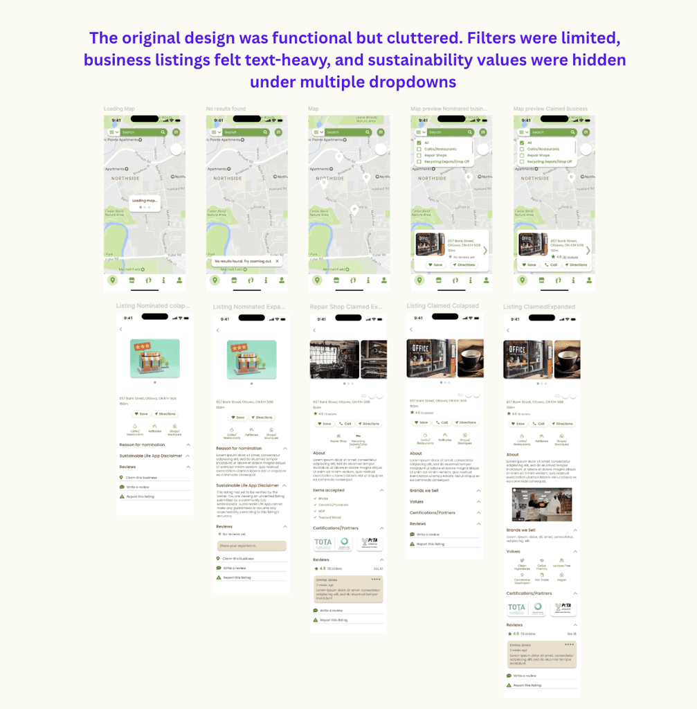
THE PROBLEM
The original map interface was functional but limited:
Users had difficulty filtering and discovering sustainable businesses.
The interface looked outdated and cluttered.
Search and navigation lacked clear hierarchy, making the experience overwhelming.
Business listings lacked visual appeal and failed to highlight key sustainability values.
Our challenge was clear:
How might we redesign the map and listing experience so that users can easily find and support sustainable businesses, while enjoying a clean and engaging interface?
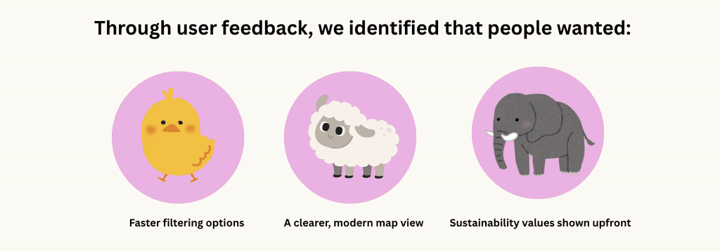
USER RESEARCH
To better understand pain points, I gathered feedback from users who regularly engage with sustainability-focused apps.
Key Insights
Filters matter: Users want to quickly narrow down eco-business categories (e.g., repair shops, cafes, recycling centers).
Visual clarity is essential: Cluttered maps create confusion and reduce trust.
Sustainability values should be visible upfront: Certifications, eco-values, and items accepted should be more prominent.
These insights guided my design decisions and restructured the navigation flow..
IDEATION
I sketched out multiple flows to address usability concerns:
Cleaner Map Interface – Reduce clutter, introduce clearer pin design, and highlight the user’s location with better contrast.
Interactive Filters – Allow users to easily toggle categories like cafes, repair shops, or recycling centers.
Preview Cards – Display business highlights in a swipeable card format before opening full details.
Reorganized Business Listings – Place sustainability values, certifications, and reviews at the forefront.
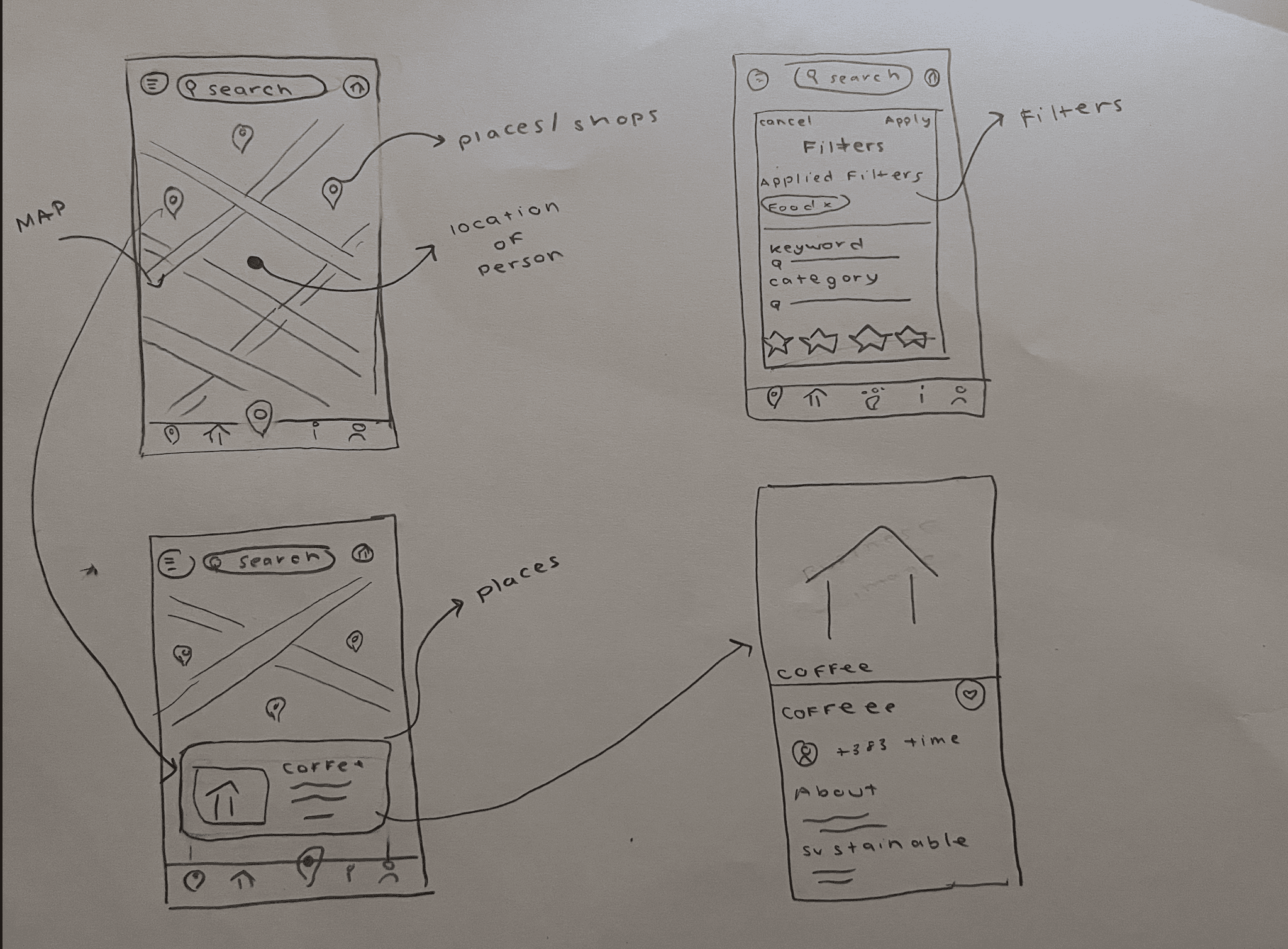
Modern Map Interface
Green location pins, cleaner background, and refined visual hierarchy.
Interactive filters for instant customization.

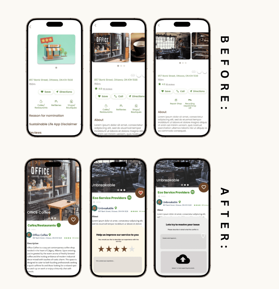
Business Preview Cards
Swipeable cards allow quick scanning of nearby eco-friendly businesses.
REFLECTIONS
This redesign project was a deep dive into creating clarity in complex interfaces. I learned the importance of:
Balancing functionality with simplicity – Too many options overwhelm users, but too few limit discoverability.
Visual hierarchy in eco-focused apps – Certifications and values need to be more prominent to build trust.
Encouraging user participation – A smoother review process helps sustain the ecosystem.
If I had more time, I would test the gamification of sustainable choices (badges, points for visiting eco-friendly places) and build a community feature where users can share sustainable lifestyle tips.
NEXT STEPS
Expand testing with diverse user groups (families, professionals, eco-enthusiasts).
Explore dark mode for accessibility.
Add real-time business updates (hours, events, repair slots).
Made with lots of love and espresso
SAMRIDDHI MAKASARE | 2025